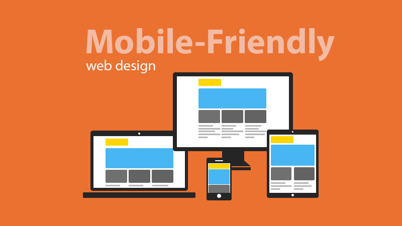
In the IT industry, we have seen the passage of web pages from the desktop to the mobile. It was not easy for web designers and web development companies to adapt to this change. During the beginning of this transition, many companies had a project to develop web applications with their separate site. Famous sites of the time had to create a side project in a way that was accessible to mobile users.

Currently, there are 2 billion smart phone and tablet users around the world. You can not simply ignore all these users and traffic, because according to a survey, about 80% of mobile users access the Internet through their mobile phone and tablet. A large number of mobile phone users are customers and mobile transactions have a higher completion rate than desktops. So in other words, a strong web presence really means that you have to persuade the desktop and mobile users.
Before hiring PHP development company for your web application development project, here are a few things to consider that will help analyze the scope of the project better.
Consider the mobile user mindset
There are a large number of mobile users who perform all their activities on the touch screen and who avoid using the desktop. Their mindset is different from that of an average desktop user. When browsing the Web on your laptop or desktop computer, you will only have to move a few lines because the screen is wider. But a mobile user needs to move a lot because of the small screen. A large part of the site will not be visible to users.
There are several ways to check the compatibility of a website on a mobile screen. Several websites offer this service for free. Just keep this in mind; no user wants to zoom in to see the content of a site just because it is not mobile compatible.


